Design Statement
In Derrida's Margins, design is not an empty vessel. Instead, this project brings design into the foreground as an active form of representation. As the designer, I approached the design by focusing on characteristics of Derrida's own reading practice and that of the philosophy of deconstruction.
An area of space has no direction, no up and down, no positive and negative. Design elements inhabit the space and define directions.
What constructs the space in which this text that you are reading lives? Do the typeface and color say anything to you?
Besides the visual devices, underlying technological systems that perhaps already have many other political and/or corporate influences also take a part in constructing the page.
I declare <!doctype html>; set language to be lang="en"; define UTF 8 to encode characters to unicode. If I do it wrong, I might get gibberish like ä¸æ–‡ä¼šå˜æˆè¿™æ ·
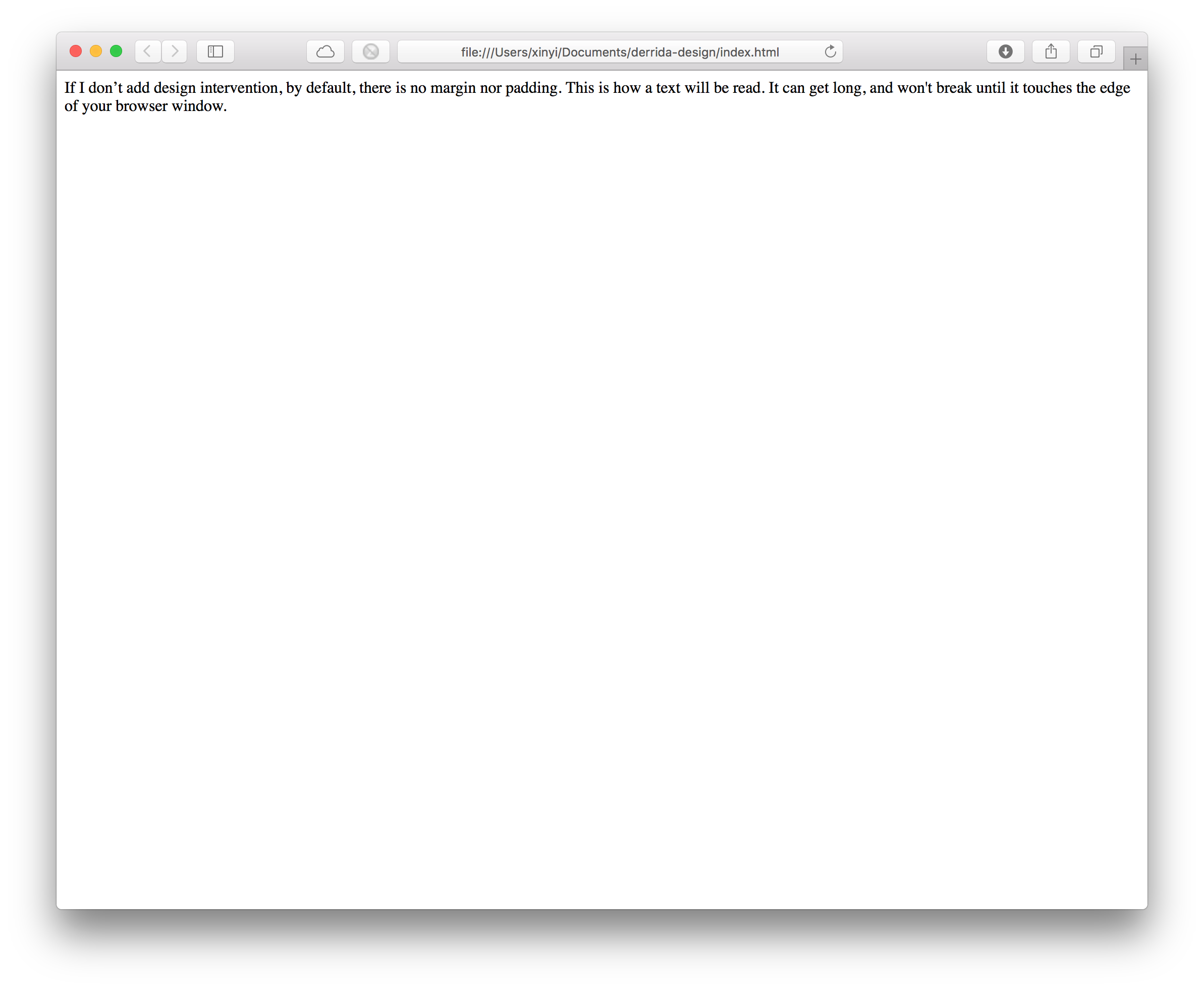
Typography design does not just focus on the alphabets and signs. It also defines negative space: contour of a letter, the area that is entirely or partially enclosed by a letter form; spacing between letters and words; margins and frames. These structures that are seemingly outside the content of work are necessities that condition representation and reading.
In some approaches desiring typographic treatment as “crystal goblet,” design serves as the transparent delivery of information. The neutral outside carries the content inside. The boundary of reader and writer is clearly defined. In other approaches, such as the wave of post-modern design responding to “the death of the author,” the form intrudes into the content. In these perhaps dramatized messages, typography is open for interpretation.
The divisions discussed above, content and form, the interior and the exterior, are also areas of concerns ofdeconstruction. Beyond providing a vocabulary of formal styles appropriated by architecture, fashion design and graphic design, deconstruction resonates with many topics in graphic design as it concerns writing and representation. Deconstruction interrogates the oppositions and asks how the overlooked and devalued outside live within the inside.
Ellen Lupton and J. Abbott Miller in their 1994 essay “Deconstruction and Graphic Design” proposed a history of graphic design through the lens of deconstruction. The essay included comparisons between the structure of early English newspapers designed to be read from the beginning to the end to the classical book. The newspaper of our century and the previous one expanded to appear on board-sheet and is a composition of reports, announcements, illustrations, advertisements and so on, where competence of content and non-linear reading are supported by typography. They argued such a study of graphic design informed by deconstruction would show “how graphic design has revealed, challenged or transformed the accepted rules of communication.”(363)
Throughout the history of typography, designers are exploring relationships between the interior of content and the invasion of design language when creating the artifact. Derrida has also consciously played with typography and marginalia in his writing in Glas, and in “Tympan” in Margins of Philosophy. Adding a different layer, when Derrida performs the active process of reading by annotating and inserting paper scrap into his books, Derrida aggressively interferes in the scared interior content of literary artifacts. The oppositions of author and reader are blurred in these multipliers of intrusion and representation.
In Derrida’s Margins, design is not an empty vessel. Instead, I’m hoping to bring design into the foreground as an active form of representation. This project approaches design with characteristics of Derrida's own reading practice and that of the philosophy of deconstruction.
Derrida’s Margins extends the intervention of visual form in verbal content to interactive media. The website creates a space open for interpretation by the visitors. Although the content is structured by books, references, and interventions (Derrida’s annotations and insertions), readers of the site can find multiple entry points, including a visualization interface, to Derrida’s relevant marks on the personal copies of the texts he cites. Expansive search and filter functions give visitors agency in a system of possibilities. The project endeavors to break down the frontiers between the visitor/reader, mediator (us, the creators of the site), Derrida, and the authors of literary texts.
The oppositions of author and reader are blurred in these multipliers of intrusion and representation. Do Derrida’s books stored in Rare Books and Special Collections possess an aura of authenticity and devalue the digital project? Or does this seemingly external representation reveal a new essential value for this collection?